
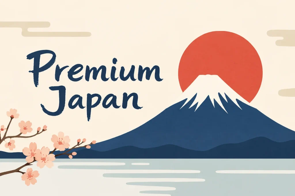
Japanese culture and lifestyle platform Premium Japan has introduced a new visual identity built around one of the country’s most recognizable symbols: Mount Fuji.
The new logo was created by designer Manabu Mizuno and his team at good design company. Rather than using detailed traditional patterns, the design reduces Mount Fuji to a simple, clear shape. The result is easy to recognize and works across websites, mobile screens, posters and event materials.
The update goes beyond the main Premium Japan logo. Mizuno also created a matching identity for the Premium Japan Award, giving the media platform and its award program a more consistent look.
That connection matters as the brand continues to expand. Some readers may know Premium Japan mainly as a website covering Japanese food, travel, crafts, art and people. But the platform is also involved in cultural events and awards. Bringing those activities under one visual system makes the relationship between them easier to understand.
Founded in 2015, Premium Japan publishes content in Japanese, English, French, Simplified Chinese and Traditional Chinese. Its aim is to introduce Japanese culture to a wider international audience, not only through famous landmarks and traditions, but also through the people and ideas shaping the country today.
To mark the launch, Premium Japan also released a conversation between Mizuno and Shigeo Usui, chief creative officer of Panasonic Holdings. They discussed the value of simplicity in Japanese design and the growing role of artificial intelligence in creative work.
Their message was straightforward: new tools can support the design process, but they cannot fully replace human judgment. Deciding what to keep, what to remove and what feels right still depends on experience and taste.
For Premium Japan, the new logo is less about making a dramatic statement and more about bringing its identity into focus. Mount Fuji may be familiar, but the challenge is finding a fresh and clear way to present Japanese culture to today’s audience.