Using AI to design a page can be surprisingly frustrating. The problem is not always that the tool cannot make changes. More often, it changes the wrong thing.
You ask it to make one button smaller, and it edits the text next to it. You say the left side feels crowded, and it starts adjusting the top of the page instead.
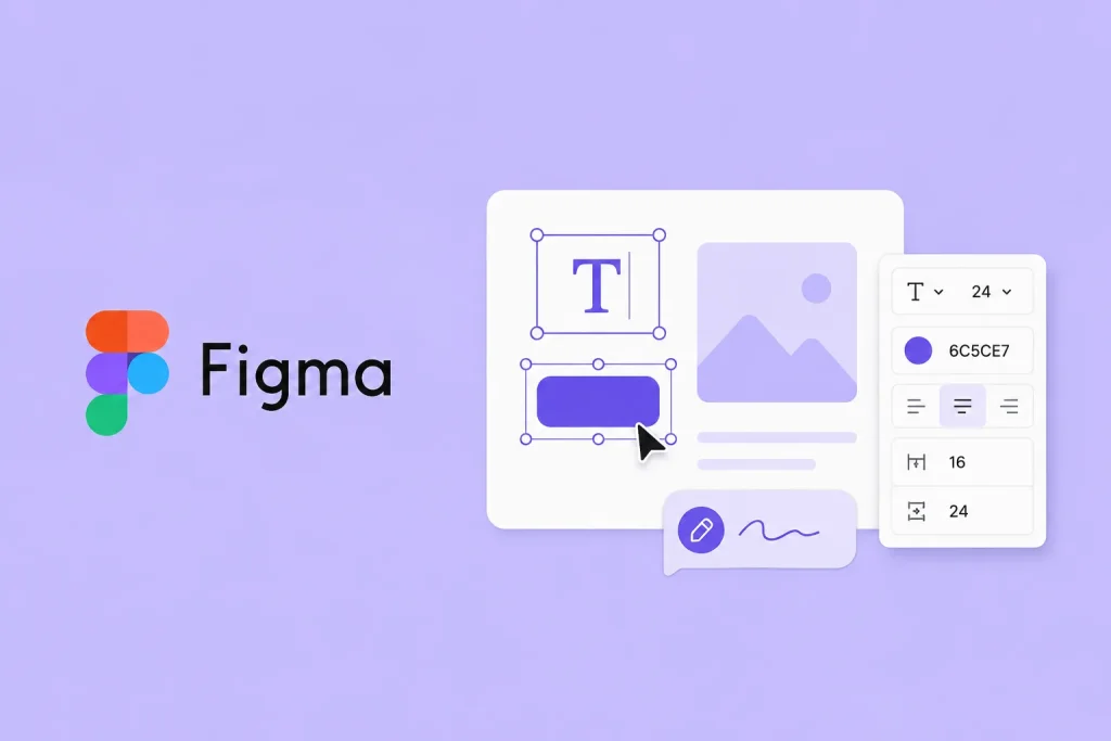
Figma is trying to make that process less confusing with two new features in Figma Make: a properties panel and comments placed directly on the canvas.
Users can now click on text, buttons, images or sections of a page and change details such as size, color, spacing and layout from a side panel. It works more like a regular design tool, so people no longer have to explain every small adjustment through a long prompt.
For changes that are harder to describe, users can leave a note next to a specific part of the design. They might circle an image and write, “Make this feel more natural,” or point to a section and say, “This area looks too busy.” Figma Make can use the location of the note to understand exactly which element needs attention.
It is similar to reviewing a design with a colleague. Instead of saying, “The blue button on the left side of the second screen,” you can simply point and say, “This one.”
That could make the tool easier to use for people who are not designers. Product managers and developers do not need to know technical terms such as layers, containers or components. They can show what is wrong and explain what they want changed.
Figma Make also lets users preview designs on phone, tablet and desktop screen sizes. Teams working with a live codebase can select an element on the page and request changes through the panel, comments or chat.
The tool will not suddenly develop perfect taste, and it may still get things wrong. But giving users a clearer way to show where a change should happen is a practical step forward. Sometimes the most useful improvement is not making the software smarter, but making it easier to understand.