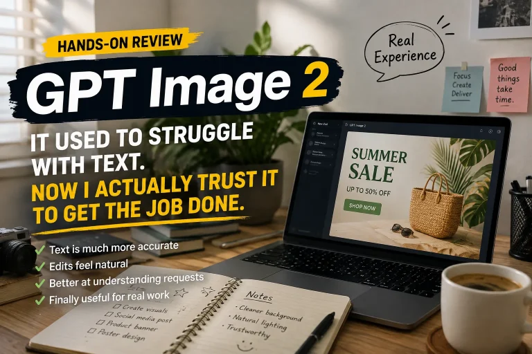
The biggest improvement in Images 2.0 is that text has gone from “hit or miss” to “actually usable.”
Ease of use: basically no learning curve.
You can just describe what you want directly in ChatGPT.
For example:
“Create a Chinese SaaS promo poster with a white background, three feature sections, a bold black headline, and blue highlights.”
That kind of task used to produce garbled text, spelling mistakes, or broken layouts very easily. Now, even if the first result isn’t perfect, you can keep refining only the part that needs fixing.
Chinese text rendering has improved a lot.
In some tests, even very small Chinese characters stay readable. For magazine covers and promotional cards, the accuracy of headlines, dates, and key copy is noticeably better than before.
Another very practical improvement is sequential image generation.
For example, if you ask for a multi-page comic built around the same character, the model can handle the story, dialogue, and visuals together while trying to keep the character and overall style consistent.
Tasks that used to require generating and rerolling one page at a time can now be handled as a longer visual sequence.
But there’s still one very real problem:
getting the text right doesn’t mean the information is right.
In infographic tests, the model may still get product prices, specifications, or comparison results wrong. The layout can look so polished that the errors are actually harder to notice at first glance.
That’s the main thing to watch.
It’s now easy to generate an infographic that looks real. The data inside still needs human verification.
What works well
- Chinese text is finally usable.
Posters, covers, and infographics are much more practical now.
- Conversational editing is convenient.
You can fix only the part you don’t like instead of rewriting the whole prompt.
- Sequential content is stronger.
Comics, storyboards, and visual series are easier to keep consistent.
- It fits real workflows.
Promo graphics, course materials, and social media assets can now take part directly in production.
- Low learning curve.
You don’t need professional design software skills to get started.
What doesn’t work as well
- Factual errors still happen.
Prices, specs, and statistics especially need to be checked manually.
- Complex tasks can be slower.
Multi-page comics and dense infographics take noticeably longer.
- Final resolution still has limits.
Large-format print and very high-precision design may still need post-processing.
- More realism also increases misuse risk.
Fake news screenshots, documents, and realistic-looking visual evidence become easier to create.
Best for
Designers and marketers
Useful for quickly creating layout drafts, promo posters, and campaign visuals.
Content creators
Covers, illustrations, and social media cards can be produced very quickly.
Teachers and trainers
Good for knowledge diagrams, information cards, and visual teaching materials.
Comic and storyboard creators
Useful for quickly testing story, character, and shot direction.
Not ideal for
Commercial projects that need a final-ready deliverable
Important information still needs human review.
Anyone who needs ultra-high-resolution output
Large-format printing and highly detailed commercial design may require additional processing.
Work where data accuracy is critical
Financial, medical, legal, and news infographics should not rely on generated content without verification.
People who don’t plan to proofread anything
The more finished the image looks, the easier it is to miss hidden mistakes.











Comments (0)